In the dynamic world of marketing, colors wield extraordinary power, capable of influencing emotions, shaping perceptions, and leaving a lasting impact on consumers. As seasoned marketers, delving into the psychology of color and leveraging its impact can profoundly enhance branding, advertising, and overall customer engagement. In this comprehensive article, we embark on an illuminating journey into the captivating realm of the psychology of color in marketing.
We’ll explore how different hues elicit distinct emotions and behaviors in consumers, unveiling the secrets behind this art of hue and its profound significance in the realm of marketing.
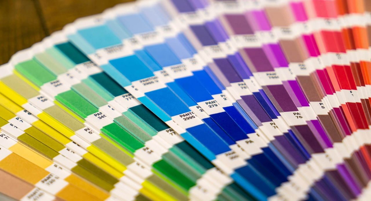
The Science Behind Colors
Colors’ profound effect on the human psyche is grounded in scientific research in the field of psychology. Different colors trigger specific neurological responses, evoking emotions, moods, and perceptions. For instance, warm colors like red, orange, and yellow elicit feelings of energy, excitement, and warmth, making them excellent choices for calls to action and creating a sense of urgency in marketing campaigns.
On the other hand, cool colors such as blue, green, and purple evoke a sense of serenity, trust, and creativity, often utilized by brands to establish reliability and connect with environmentally-conscious consumers. Understanding the science behind colors is the cornerstone of crafting effective marketing strategies that resonate deeply with target audiences.
Red, Orange, and Yellow in Marketing
Warm colors are known for their ability to captivate attention and stimulate emotional responses. Brands often use red, orange, and yellow in their marketing to evoke enthusiasm, excitement, and a sense of urgency. For instance, fast-food chains like McDonald’s leverage the color red to stimulate appetite and create a sense of urgency, leading to impulse purchases. Similarly, retailers frequently incorporate orange in their branding to signify affordability and a welcoming atmosphere, encouraging potential customers to explore their products and services.
The Impact of Cool Colors – Blue, Green, and Purple
Cool colors are associated with calmness, trust, and creativity. Blue, in particular, is one of the most widely used colors in branding, signifying reliability and dependability. Tech giants like IBM and Facebook utilize shades of blue to instill trust and loyalty among their users. Green, often linked to nature and sustainability, is favored by eco-friendly brands seeking to connect with environmentally-conscious consumers.
Purple, associated with luxury and creativity, is a popular choice among beauty and artistic brands. By incorporating cool tones into marketing materials, brands can create a sense of tranquility and nurture strong emotional connections with their target audience.
Black, White, Gray, and Brown in Branding
Neutral colors, such as black, white, gray, and brown, provide a sense of sophistication, timelessness, and balance. These hues are commonly used in minimalist branding and high-end luxury products. Luxury fashion brands often employ black and white in their logos and packaging to convey elegance and exclusivity. Gray, with its balance between black and white, is favored by tech companies for its modern and minimalist appeal.
Brown is often associated with natural and organic products, making it a popular choice for environmentally-conscious brands. Neutral colors are highly versatile and can adapt to various branding styles, conveying simplicity and elegance across diverse industries.
Cultural Influences on Color Perception
Colors hold different cultural meanings and associations across various regions. For example, while white represents purity and innocence in Western cultures, it symbolizes mourning in parts of Asia. Likewise, red is commonly associated with luck and prosperity in China, but it signifies danger in Western cultures. When marketing internationally, brands must be mindful of cultural sensitivities and adapt their color choices accordingly.
Targeting specific colors that align with local cultural values can foster stronger connections with international audiences, avoiding potential misinterpretations and misunderstandings.
Crafting the Perfect Palette
Creating a cohesive color palette that reflects the brand’s personality is a crucial aspect of effective branding. Different color combinations evoke specific emotions and contribute to shaping the brand’s identity. For example, a combination of red and yellow can create a sense of urgency and excitement, ideal for promotions and sales events.
In contrast, a palette of blue and green evokes a feeling of trustworthiness and environmental consciousness, suitable for sustainable and eco-friendly brands. Brands can experiment with various color combinations and consider color psychology principles to ensure that their palette aligns with their mission, values, and target audience.
From Clicks to Conversions
Colors play a pivotal role in guiding consumers through their buying journey. The careful use of color in website design, product packaging, and marketing materials can significantly impact consumer behavior. For instance, a well-designed website with a pleasing color scheme can increase user engagement and time spent on the site, ultimately boosting conversions.
Moreover, color choices in product packaging can influence purchase decisions, with specific colors triggering positive emotions and associations with the product’s quality and desirability. By considering color psychology in marketing materials, businesses can enhance website engagement, encourage repeat purchases, and foster a positive customer experience.
A Case Study in Color
Examining the color strategies employed by iconic brands offers valuable insights into effective color use in marketing. Coca-Cola’s iconic red branding exemplifies how color can become synonymous with a brand’s identity, evoking feelings of happiness and excitement.
Apple’s minimalist approach, featuring sleek white designs, conveys simplicity, sophistication, and innovation. Starbucks’ use of green aligns with its commitment to sustainability and nature. By studying these case studies, marketers can gain a deeper understanding of how colors play a pivotal role in shaping brand perception and fostering customer loyalty.
Conclusion
Colors possess an extraordinary language, speaking directly to the heart and minds of consumers. In the realm of marketing, the psychology of color holds immense power to influence perceptions and drive actions. By grasping the scientific principles behind colors and strategically tailoring color choices to align with brand identity and target audience preferences, marketers can unlock the true potential of the art of hue.
As we continue to navigate the vibrant landscape of marketing, let us embrace the artistry of colors, for they are the enchanting brushstrokes that paint unforgettable brand experiences in a world brimming with hues.